Brightly Brand Work

Expanding the Brightly Illustration Library
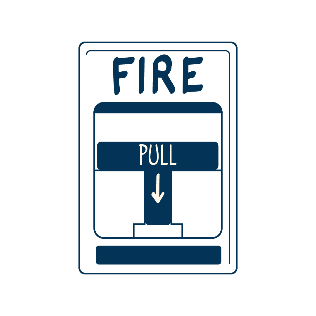
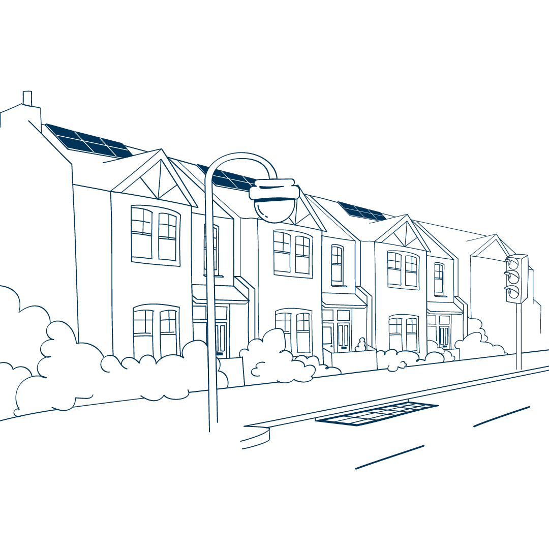
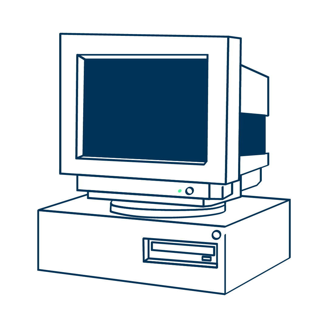
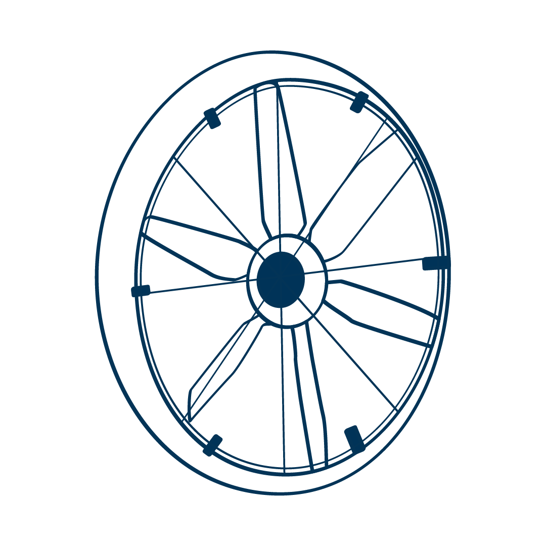
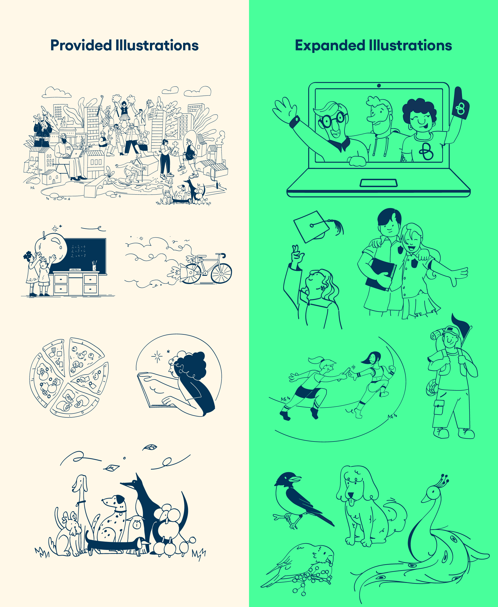
When Dude Solutions rebranded to the very whimsical and metaphor-heavy Brightly illustration style, we were provided a library of around 20 images. A frequent complaint from stakeholders was that they didn’t understand the metaphors, and thus clients likely wouldn’t either. So I frequently needed to provide new illustrations for assets I was working on.
The Process
When I am first creating illustrations for a brand I am new to, I start small. I take existing assets and try to recreate them with minor tweaks. This allows me to understand what makes the style “the style” before delving in and making something from scratch.
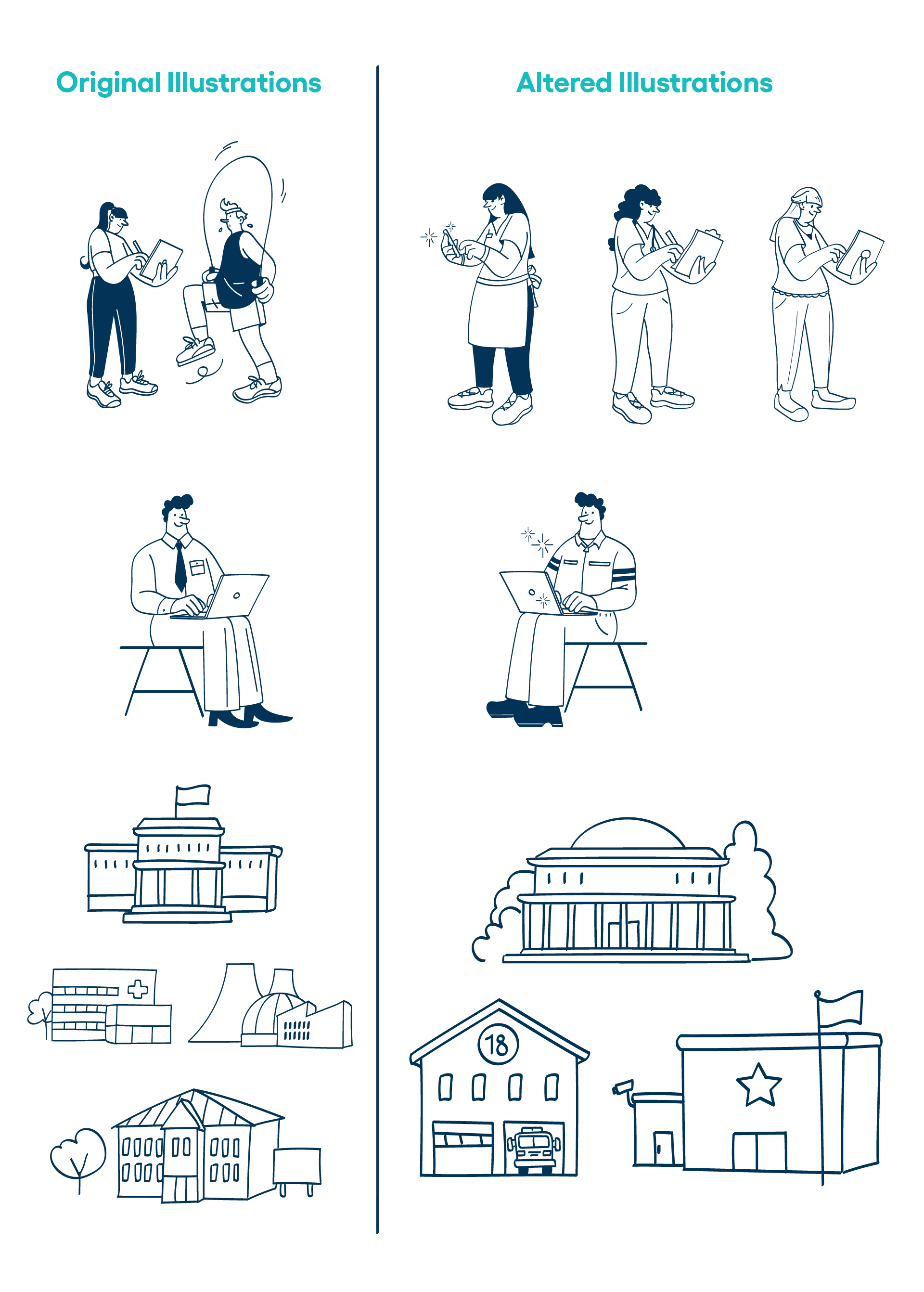
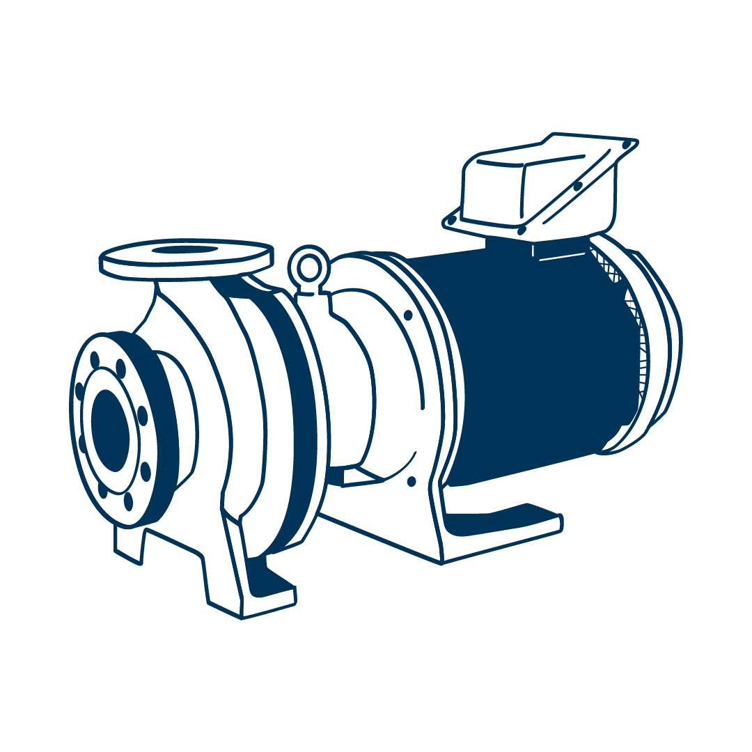
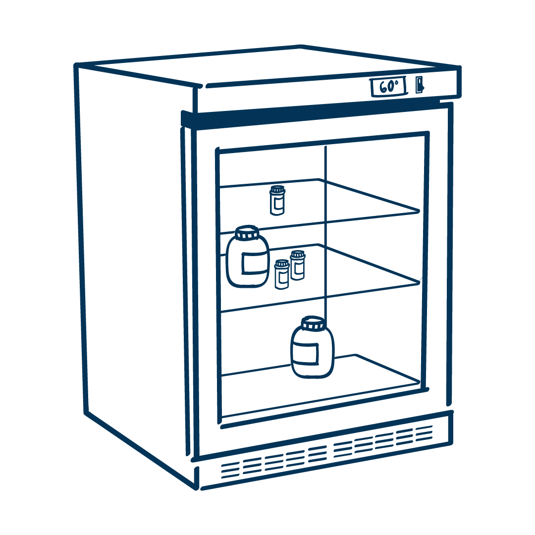
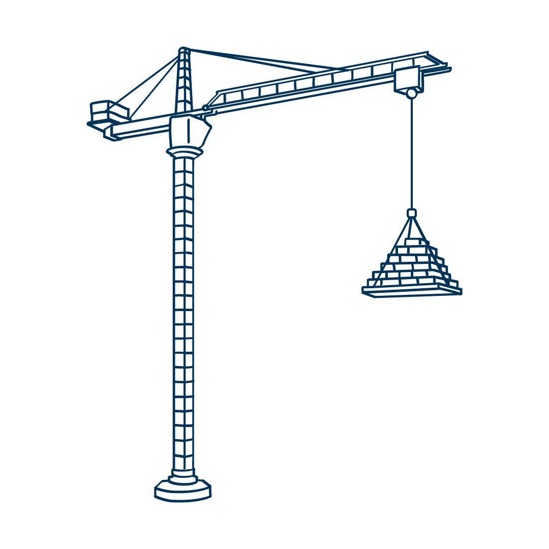
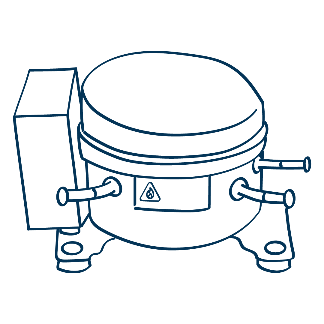
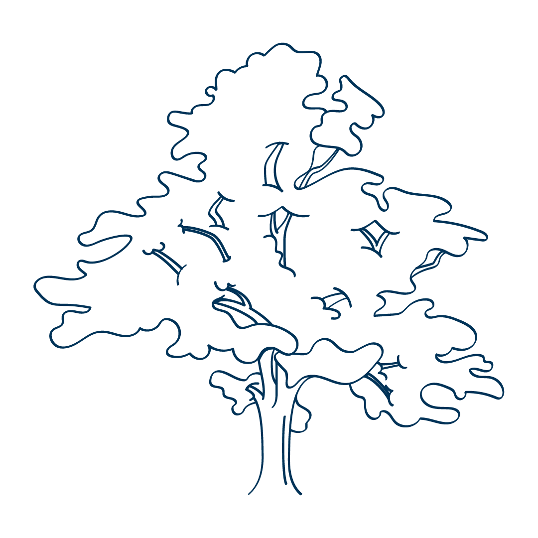
My next step is to make some new illustrations that closely resemble original ones, and then iterate on those. From there I have a lot of freedom to create brand new illustrations from scratch that are on brand, as seen in the first image of this project.
Expanding the Style
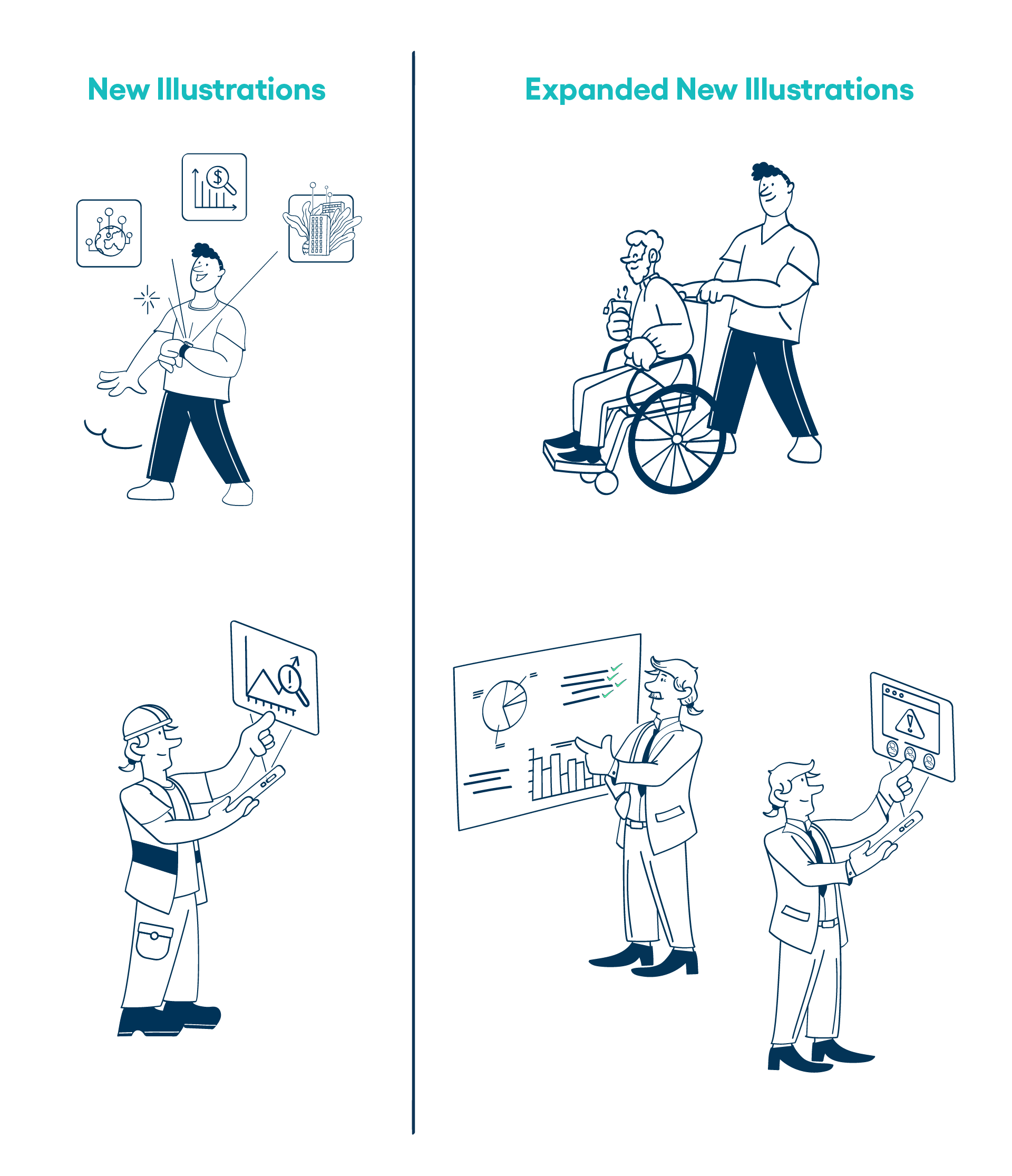
I frequently received requests for illustrations that were very specific - plants native to specific states or countries, specific pieces of manufacturing equipment (which are often very hard to find stock photos for), etc. So while the original brand style is very cartoon-like and simple, I needed to find a way to fit in more details. To do this while trying to stay somewhat in the brand, I used the same brush styles, tried to keep away from straight, sharp edges, and where I could I tried to add in that organic, cartoon flair.

